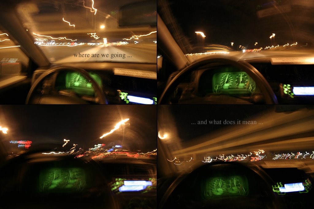
Choose A Path
... but don't close off your options for another ...

Click the image to see a larger version.
Please let me know what you think. Thanks,
-david
Click the image to see a larger version.
Please let me know what you think. Thanks,
-david
posted by david at 7:04 PM
![]()
![]()


5 Comments:
very cool!
text is fun, it really does add a lot - not always appropriate, but you used it well here.
i like the top left the best :)
you already know that I like this but ill say it again... I like this :)
Look Ma! No Hands!
im not sure if the text adds a whole lot, because thats what i was thinking anyway but i like your experimentation. its a gutsy post.
if text then maybe a different font.
i just don't like serifs.
something ...sans...serifs...heh. could be maybe more futuristic.
nifty pictures--cool colours.
Post a Comment
<< Home